A Mathematician's Proposal
October 2007
Michael C. Burke
A call for educators to emerge from their monastic disciplinary cells and address the challenges of quantitative literacy.
In Mathematics and Democracy, Lynn Arthur Steen describes quantitative literacy as "a habit of mind, an approach to problems that employs and enhances both statistics and mathematics." What characterizes this habit of mind, this way of thinking? Why is it important? How can it be taught?
These are questions much on my mind as a college mathematics teacher, but I believe they matter far beyond my discipline. Quantitative literacy, the ability to discriminate between good and bad data, the disposition to use quantitative information to think through complex problems—these are capacities that educators across fields should be helping students develop. I'd like to lead you to this conclusion through an extended example.
Princeton University economics professor Paul Krugman recently began a blog on The New York Times website. In his first post, Krugman wrote, "I'll be using this space to present the kind of information I can't provide on the printed page—especially charts and tables, which are crucial to the way I think about most of the issues I write about." Krugman then introduces a graph that presents a picture of income distribution in the country by displaying the share of total income earned by the richest 10 percent of Americans.
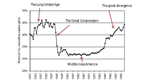
On the basis of this graph, Krugman posits that the "middle class America" period from 1950 to 1970 produced a society "without extremes of wealth or poverty, a society of broadly shared prosperity," and that this period is, in fact, an aberration. The years since 1970, as Krugman's graph clearly shows, have been marked by a gradual return to the America that existed before what he calls The Great Compression in the World War II years, an earlier America characterized as the Gilded Age.
How did this shift occur? How did this country decide to return to a Gilded Age in which extremes of wealth and poverty were the norm? The answer, of course, is that we made no such conscious decision. Instead, we made numerous small decisions, without any articulated vision or plan. We did not see what we were doing, and could not therefore really "decide," because we did not know how to look. There was public discussion, certainly, but it was fragmented, fractious, and marked by a conspicuous lack of grounding in the underlying reality of the America of the late twentieth century and the trends at work that led to the America of today.
In contrast, Krugman's use of a graph illustrates an especially powerful way to look at and think about our world. The graph, he says, is "central to how I think about the big picture, the underlying story of what is really going on in this country." Using the tools of economics, he shows us that things that are otherwise difficult to see or understand can sometimes become dramatically apparent when we look at the right graph, table or chart. These visual representations of data are indispensable tools for understanding, and they can often clarify what is obscured by the sound and fury of public debate.
Caveats are in order here, of course. Krugman uses the "right graph," but it is also possible to construct the "wrong graph." Graphs, like words, can be used to mislead. There is also a great deal of subtlety involved. As Edward Tufte elegantly illustrated in The Visual Display of Quantitative Information, it can be difficult to envision what the right graph for a given situation should look like. Which graph will illuminate rather than obscure, clarify rather than confuse?
But my larger point here is that the content of our thoughts and the depth of our understanding are dependent on the tools we bring to the task. What we think is intertwined with how we think. And the ability to think in terms of quantitative data, in terms of tables and graphs, is indispensable for understanding our modern world. This should be part of what we teach all our students—not just students in selected courses or selected majors.
With that aim in mind, I would propose that we begin by redesigning our freshman and sophomore writing programs in order to place a significant emphasis on working with quantitative data, and on the visual representation of that data. We write, after all, to figure out what we think. And we ask our students to write so that they will learn how to think.
I can imagine that many who oversee our writing programs would not be eager to implement such a program. After all, it is perhaps asking them to teach our students to think in ways that they themselves do not think. That's a tall order, indeed. Of course, the responsibility for rethinking the way we teach writing on our campuses should be shared. Mathematics faculty, in particular, should take the lead here, but others who view the world through a quantitative lens—statisticians, economists, physicists, biologists, even some psychologists—should contribute as well. It is well past time for those of us with a quantitative cast of mind to become involved in a serious way with the writing programs on campus. For the majority of our students, this is where the action is, and accordingly, this should be one of the places where we concentrate our efforts.
We need to come to terms with some basic questions. Since the ability to think quantitatively is, in fact, essential to understanding today's world and to acting effectively and wisely as a citizen, we have an obligation to ask: are we teaching these skills? Do we routinely require students to build their arguments on an analysis of the data relevant to an issue? Do we require them to create their own tables and graphs to support their arguments? Are we teaching our students how to get beyond the rhetoric surrounding important issues, how to see the underlying trends at work, and how to cut through the distractions of the often loud, heated debate?
If the answer to these questions is no, then we have work to do.